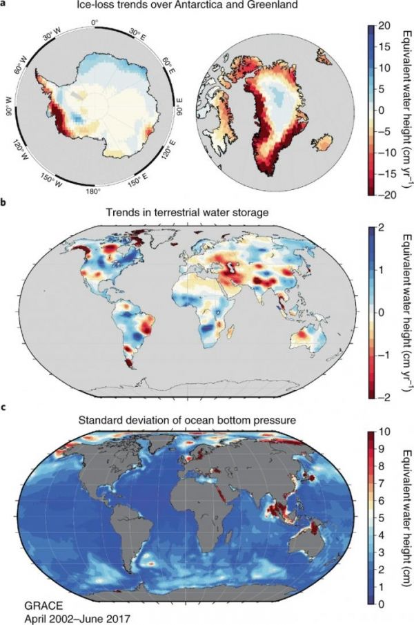
The University of Texas at Austin team that led a twin satellite system launched in 2002 to take detailed measurements of the Earth, called the Gravity Recovery and Climate Experiment (GRACE), reports in the most recent issue of the journal Nature Climate Change on the contributions that their nearly two decades of data have made to our understanding of global climate patterns.
Among the many contributions that GRACE has made:
- GRACE recorded three times the mass of ice lost in the polar and mountainous regions since first beginning measurements — a consequence of global warming.
- GRACE enabled a measure of the quantity of heat added to the ocean and the location for said heat that remains stored in the ocean. GRACE has provided detailed observations, confirming that the majority of the warming occurs in the upper 2,000 meters of the oceans.
- GRACE has observed that of the 37 largest land-based aquifers, 13 have undergone critical mass loss. This loss, due to both a climate-related effect and an anthropogenic (human-induced) effect, documents the reduced availability of clean, fresh water supplies for human consumption.
Read more at University of Texas at Austin
Image: Global representation of trends and variability in ice and water mass recovered by GRACE over 15 years. The top figure, which shows trend maps over Antarctica, Greenland and part of the Arctic, represent changes in ice mass. The middle trend map mainly represents changes in the terrestrial water storage, as well as large trends related to continental rebound after glacier ice-melts over continental areas, such as Alaska, Patagonia and the Canadian Arctic. The trends of the terrestrial water storage are partially related floods and droughts, but also reflect, for example, long term changes in groundwater depletion by human activity. The bottom figure shows variability in the ocean bottom pressure and are particularly relevant for understanding these effects in in the difficult to observed southern oceans and the Arctic Ocean. For the first two, the red represents mass loss and blue represents mass gain. In last figure, the color scales represent variability, with the highest variability shown in red. (Credit: Cockrell School Of Engineering, The University of Texas at Austin)


