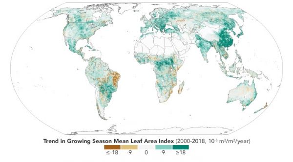
Scientists previously established that the world is greener than it was in the early 1980s. Updated maps show that the trend has continued, and researchers say reduced global warming is among the consequences.
The map above shows where greenness increased (green) and decreased (brown) across the planet between 2000 and 2018. Specifically, it shows the trend in the “leaf area index”—the amount of leaf area relative to ground area—during the growing season. The index is computed using data from the Moderate Resolution Imaging Spectroradiometer (MODIS) on NASA’s Terra and Aqua satellites. White areas are where the land is barren, built upon, or covered with ice, wetlands, or water.
Note that the map does not show overall greenness, which is why it does not exactly match heavily forested areas like the Amazon or the Congo Basin. Instead, the map shows how greenness has changed —a phenomenon most obvious in places like China and India where agriculture has intensified and governments have made efforts to conserve and expand forests.
Continue reading at NASA Earth Observatory
Image via NASA Earth Observatory


