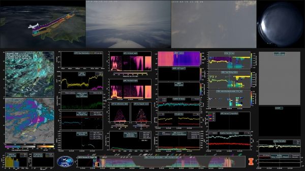
NASA field campaigns – which study Earth from air, sea, and on the ground – return vast troves of valuable data. Sometimes, however, processing so much raw information and related satellite imagery can slow the pace of scientific discovery. To combat that lag in output, researchers and programmers have developed a prototype 3D video dashboard for data from field campaigns that will make information easier to process and more readily available to anyone across the Earth science community.
“Navigating and visualizing thousands of raw data files collected during a field campaign is an extraordinarily tedious task, and – left as is – might reduce the scientific return of the campaign,” said Larry Di Girolamo, a professor of atmospheric sciences at the University of Illinois.
Di Girolamo collaborated with programmers and designers from the Advanced Visualization Lab (AVL) at the University of Illinois Urbana-Champaign National Center for Supercomputing Applications in Urbana, Illinois, to prototype a new process for communicating data from field expeditions.
The final visualization prototypes include a three-minute video in 3D, as well as a longer data dashboard video depicting 76 different data variables. These visualizations – as well as the raw data from the CAMP2Ex field campaign – meet NASA’s Open Source Science requirements and are freely available to the public.
Continue reading at NASA Earth Science News
Image via NASA Earth Science News